
The Whole Hand Changes How You See a Design
The back of the hand offers a larger surface than the fingers, but its shape is far from rectangular. There are the raised knuckles, the base of the thumb, tendons that become visible with movement and an area that narrows towards the wrist. A motif conceived as a square image may seem unbalanced once placed on this living surface.
To choose a composition, start by thinking about the path the eye will follow. Do you want a strong central feature, such as a large flower? A diagonal movement connecting the wrist to a finger? Or a design deliberately positioned to one side? This simple decision helps establish what should stand out most and what will remain secondary.
There is no obligation to cover the entire hand. A design that leaves large areas bare can be just as refined as dense mehndi. The difference lies in the intention: highlighting one principal shape or creating an uninterrupted decorative surface.
Four Easily Recognisable Types of Composition
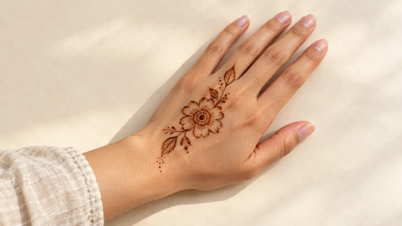
The central flower is an easy-to-read option. One dominant element sits in the middle of the back of the hand, possibly accompanied by leaves or dots. This composition naturally draws the eye to the centre. If everything is the same size, the flower loses its leading role.
The botanical diagonal begins near the wrist and rises towards the base of a finger. It guides the eye diagonally and can suggest movement. A flowing branch is better suited to this approach than a series of unconnected flowers.
The side decoration mainly occupies the outer edge of the hand. It preserves a large empty area in the centre, emphasising its contemporary character and potentially echoing a piece of jewellery.
The bracelet design connected to the hand uses one element on the wrist and another on the back of the hand, linked by a line or a series of dots. The connection should be easy to follow; it does not need to be thick.
Making a Design Readable Without Oversimplifying It
The first principle of composition is hierarchy. Imagine a main flower, two secondary leaves and a small row of dots. If all these elements take up exactly the same space and have the same thickness, they seem to compete. If the flower remains dominant, the other shapes support it.
The second principle is rhythm. Repeating three small dots near two leaves may be enough to echo a detail already present in the design. Repeating ten different motifs can sometimes undermine coherence. Viewers find it easier to recognise a composition that reuses two or three shapes than one that changes its visual language every centimetre.
The third principle is negative space: the skin left visible around and between the elements. This space is not wasted; it separates the details and allows a large flower to stand out. Dense compositions can work beautifully too, but they require special attention to contrast between filled areas and fine details.
Table: Which Composition Matches Your Preference?
| What you mainly want | Composition | Strength | Watch out for |
|---|---|---|---|
| A very visible centre | Central flower | Instantly recognisable | Overcrowding around it |
| A design that follows the hand | Botanical diagonal | Movement | Confusing direction |
| A light result | Side border | Clear space | Motif hidden at certain angles |
| A jewellery effect | Wrist connected to the hand | Continuity | Connection too thick |
You can like several styles at once. For your first choice, test their outlines on a photograph of your hand or a hand-drawn sketch. Do not assess only the petals and details: look at the overall shape from a distance.
Should the Fingers Extend the Design?
Not necessarily. If the composition on the back of the hand is already striking, leaving the fingers bare can give it greater presence. On the other hand, a small leaf, a line or a few dots on one finger can visually extend a diagonal.
The important thing is to avoid creating two designs that compete for attention. If a branch naturally climbs towards the index finger, a different, very elaborate pattern on the ring finger may disrupt the unity. Try repeating a shared shape: the same type of leaf, dots of a comparable size or similar line thickness.
That is why the pages dedicated to fingers and bracelets will link to this guide. Each explains a particular placement; here, we are discussing the balance of the whole hand.
Reading an Inspiration Photograph Correctly
A beautiful photograph does not always tell the whole story. A hand may be positioned to flatter the design, turned to hide part of the wrist or framed to make the composition look larger. Before settling on a motif, ask whether you still find it attractive in a photograph of the hand at rest.
For the illustrations on this page, we will show at least one full view and one close-up for each of the four types of composition. The close-up will reveal the shapes. The full view will show how they occupy the available space.
Key point: choose the direction of the design first, then the main element, and only then the details. Doing it the other way round often leads to piling on ornaments to compensate for a lack of structure.
Frequently Asked Questions
Do I need to cover the whole back of the hand?
No. A central, diagonal or side composition can be highly expressive while leaving large areas bare.
Where should I place a large flower?
In the centre if you want a clear focal point, or slightly off-centre if you prefer a more dynamic composition.
Does the design have to extend onto the fingers?
No. Extending it towards the fingers is an option, not an obligation.
How do I choose between floral and geometric patterns?
Ask yourself whether you prefer a flowing, organic impression or a structure based on lines and repetition. Both styles can be discreet or elaborate.
Explore More
Sources and Methodology
- The Metropolitan Museum of Art — Woman Applying Henna: an example of historical documentation of henna practice, without claiming that the image validates contemporary designs.
Henna on the Hand: Choosing a Design That Truly Flatters Your Hand
When looking for “hand henna” inspiration, the most spectacular photographs immediately catch your eye. Yet the most elaborate design is not always the one that best complements the hand. A successful composition also depends on the spaces left bare, the direction of the pattern and the way it follows the fingers.
Before choosing a design, lay your hand flat and look at three things: the width of the back of your hand, the apparent length of your fingers and the space available near your wrist. These reference points are more useful than a rule such as “this hand shape must wear this pattern”. There is no compulsory design: the aim is to adapt the composition to your style and comfort.
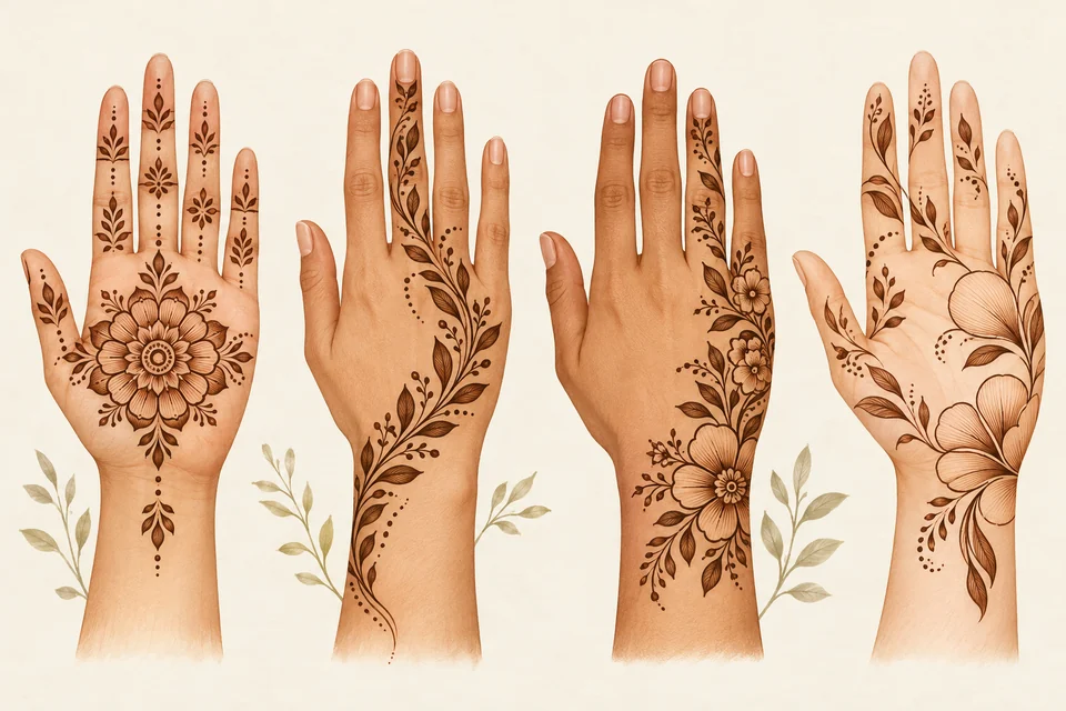
Four very different compositions
A central composition arranges the design around a flower or rosette placed on the back of the hand. It creates a clear focal point. If you prefer an understated look, a few leaves extending towards one finger are enough; there is no need to fill every space.
A diagonal composition runs from one edge of the hand towards a finger or the wrist. It creates movement and may look lighter than a highly symmetrical decoration. Its success depends greatly on negative space: if the details become too crowded, the diagonal visually disappears.
An asymmetrical design decorates one part of the hand and leaves the other almost bare. It works particularly well with a floral branch or a small arrangement of geometric elements. It is an appealing option if you want a modern look that pairs easily with jewellery.
An open, airy design uses large petals, small lines and deliberately clear areas. Viewed from a distance, it is often easier to read than a mass of tiny details. It is a good starting point if you are discovering mehndi and want to understand proportions before trying the densest ornamentation.
Scroll horizontally to read all columns.
| Style on the back of the hand | Desired effect | What to watch out for |
|---|---|---|
| Central design | Draws the eye towards the centre | Do not crowd the rosette with too many details |
| Diagonal design | A sense of movement | Keep the direction clear |
| Floral asymmetry | Contemporary appearance | Maintain balance despite the empty space |
| Airy design | Clarity and lightness | Avoid elements becoming too isolated |
What if you want an easy design?
Choose a composition with one main shape and two or three secondary elements. A flower with leaves, for example, lets you experiment with scale, rhythm and orientation without demanding a complex drawing. If you want to learn the techniques step by step, our guide to easy designs is a better starting point than this page about placement inspiration.
A visual mistake that is often overlooked
A photograph of a design on a still hand does not show what happens when you bend your fingers or wear a bracelet. A pattern may look perfectly balanced in a picture, then become difficult to read next to a large ring or a tight sleeve. If you plan to wear jewellery, treat it as part of the composition rather than an afterthought.
Key point: negative space is a genuine design tool on the hand. Elegance comes not from the number of lines, but from how well they work together.
Must a design on the back of the hand cover the fingers? No. A composition can stay entirely on the back of the hand or extend a few details towards one or two fingers. It all depends on the look you want.